Audit a Design System in 30 Minutes
A step-by-step workflow to audit any design system using AI tools. Check token naming, component health, accessibility, and visual consistency in one session.
- Basic terminal knowledge
- Claude Code, Codex, Cursor, or another repo-aware AI assistant
- 5m
Token health
Raw values, naming violations, unused tokens
- 5m
Component parity
Figma vs code drift, missing states
- 5m
Accessibility
Contrast, focus states, touch targets
- 5m
Documentation
Outdated or missing component docs
- 10m
Report
Prioritized findings with fix owners
What you’ll audit
In 30 minutes, you’ll run five checks against your design system and walk away with a prioritized report. No guessing, no spreadsheets, no “we should really look at that someday.”
Here’s the plan:
| Check | Time | What it catches |
|---|---|---|
| Token Naming | 5 min | Inconsistent names, wrong formats, missing semantic layers |
| Component Health | 5 min | Detached instances, missing variants, orphaned components |
| Accessibility | 5 min | Contrast failures, missing ARIA, keyboard traps |
| Visual Consistency | 5 min | Theme mismatches, responsive breakage, spacing drift |
| Documentation Coverage | 5 min | Undocumented components, stale docs, missing examples |
Plus 2 minutes to set up and 3 minutes to generate the final report.
This works on any design system. You don’t need a perfect setup. You don’t need Storybook (though it helps). You just need your token files and component code.
Setup (2 min)
Before you start, have these ready:
- Your token files. JSON, YAML, or CSS custom properties. If you use Tokens Studio, Style Dictionary, or Figma Variables exported to JSON, you’re set.
- Your component source code. The folder where your React, Vue, or web components live.
- A repo-aware AI assistant. Claude Code, Codex, Cursor, or another tool that can read your project files.
cd ~/your-design-systemThat’s it. No special plugins to install. The important part is that the assistant can read your codebase directly.
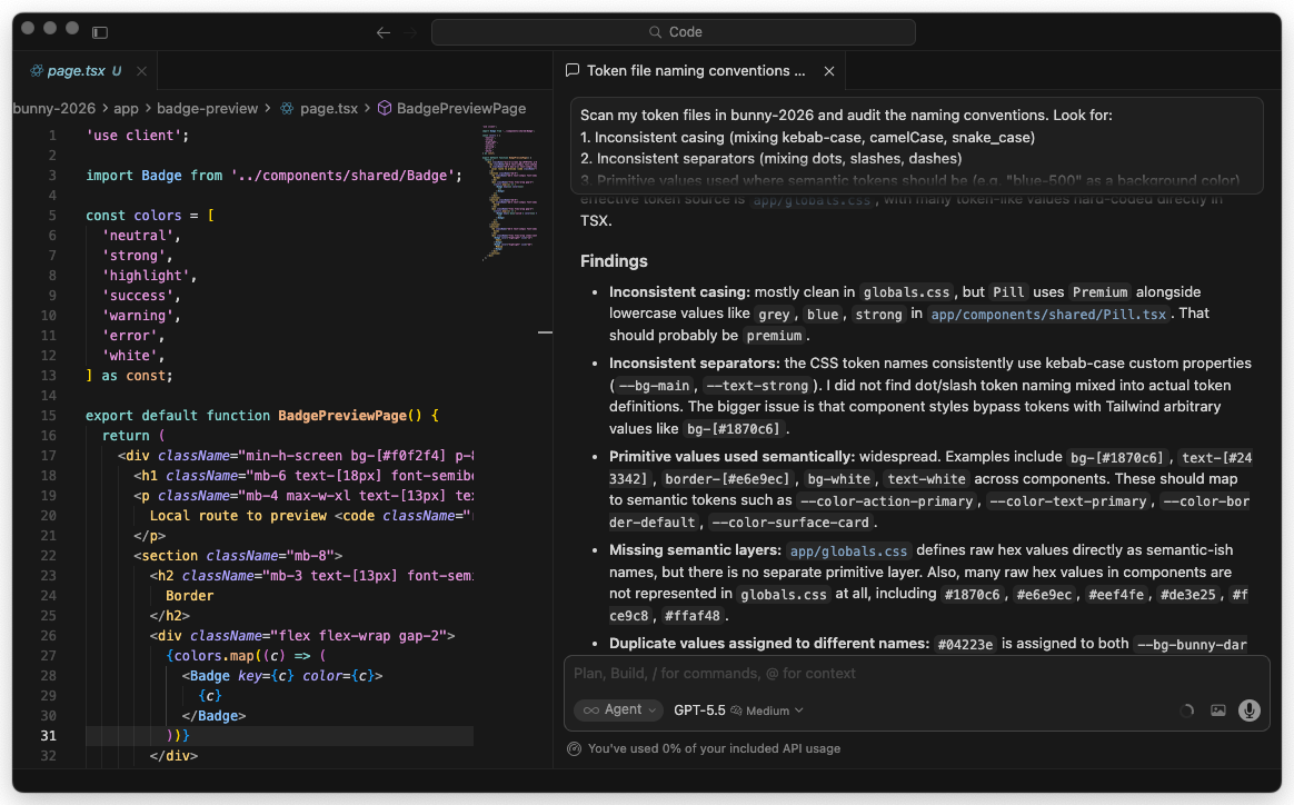
Check 1: Token Naming (5 min)
Token naming is where most design systems quietly fall apart. One person writes color-bg-primary, another writes colorBackgroundPrimary, and six months later nobody knows which is correct.
Run the audit
Paste this prompt into Claude Code:
Scan my token files and audit the naming conventions. Look for:
1. Inconsistent casing (mixing kebab-case, camelCase, snake_case)
2. Inconsistent separators (mixing dots, slashes, dashes)
3. Primitive values used where semantic tokens should be (e.g. "blue-500" as a background color)
4. Missing semantic layers (raw hex values without an alias)
5. Duplicate values assigned to different names

Check these paths: tokens/, src/tokens/, styles/tokens/
Report findings grouped by severity: error, warning, info.
What you’ll see
Claude will scan your files and return something like this:
Token Naming Audit Results
==========================

Errors (3):
  - tokens/colors.json: "blue-500" used directly in component tokens
    → Should alias to a semantic token like "color.background.accent"
  - tokens/colors.json: Raw hex #1a73e8 found without token alias (line 42)
  - tokens/spacing.json: Mixed separators found. "spacing-sm" vs "spacing.md"

Warnings (5):
  - tokens/colors.json: "colorBgPrimary" uses camelCase while other tokens
    use kebab-case (23 kebab vs 4 camelCase)
  - tokens/colors.json: "gray-1" through "gray-9" naming. Consider "gray-100"
    through "gray-900" for consistency with industry conventions
  - tokens/typography.json: "font-size-big" is vague. Consider "font-size-lg"
    to match existing size scale (sm, md, lg, xl)
  ...

Info (2):
  - 147 tokens scanned across 4 files
  - Dominant convention: kebab-case with dot separators (89% of tokens)
Quick fix
If Claude finds inconsistencies, ask it to fix them:
Rename the 4 camelCase tokens to match the kebab-case convention
used by the other 23 tokens. Show me the diff before applying.
Check 2: Component Health (5 min)
Healthy components have complete variant sets, no detached instances floating around, and clear boundaries between what’s a component and what’s just a styled div.
Run the audit
Audit my component library for health issues. Check:
1. Components with only 1 variant (might need more states)
2. Components missing common states: disabled, loading, error, hover, focus
3. Components that import other components but aren't in the component index
4. Prop types that use "any" or have no TypeScript types
5. Components over 300 lines (candidates for splitting)

Component directory: src/components/
Give me a health score for each component (A/B/C/D/F).
What you’ll see
Component Health Report
=======================

src/components/Button/
  Score: A
  Variants: primary, secondary, ghost, danger, link (5)
  States: disabled ✓, loading ✓, hover ✓, focus ✓
  Lines: 142
  Types: Complete

src/components/Modal/
  Score: C
  Variants: default (1 only)
  States: disabled ✗, loading ✗
  Lines: 387 ⚠ Consider splitting
  Types: 3 props use "any"
  Issues:
    - No size variants (sm/md/lg)
    - onClose callback not typed
    - Body content area has no max-height/scroll handling

src/components/DataTable/
  Score: D
  Variants: default (1 only)
  Lines: 612 ⚠ Needs refactoring
  Types: Missing entirely
  Issues:
    - No loading state
    - No empty state
    - No error state
    - No sorting/filtering variants
    - 4 inline styles found (should use tokens)

Summary: 12 components scanned
  A: 3 | B: 4 | C: 3 | D: 2 | F: 0
Quick fix
Focus on the D-rated components first:
For the DataTable component, generate a loading state, empty state,
and error state. Follow the patterns from the Button component
which already handles these well.
Check 3: Accessibility (5 min)
Accessibility issues are the ones that get your company in trouble. They’re also the easiest to catch automatically.
Run the audit
Run an accessibility audit on my components. For each component, check:
1. Color contrast ratios (WCAG AA minimum: 4.5:1 for text, 3:1 for large text)
2. All interactive elements have visible focus indicators
3. ARIA attributes are present and valid (not just aria-label="button")
4. Keyboard navigation works (no onClick without onKeyDown)
5. Images/icons have alt text or aria-hidden
6. Form inputs have associated labels

Check: src/components/
Use my token values from tokens/ to calculate actual contrast ratios.
What you’ll see
Accessibility Audit Results
============================

Critical (fix immediately):
  ❌ Button/ghost variant: text color "color.text.subtle" (#8B8B8B)
     on background "color.bg.surface" (#FFFFFF)
     Contrast ratio: 3.1:1 (needs 4.5:1 for AA)

  ❌ Input: no <label> element or aria-label on 2 of 3 variants
     → Screen readers cannot identify these fields

  ❌ Dropdown: menu items not keyboard-navigable
     → Only mouse click handlers, no onKeyDown

High:
  ⚠ Modal: focus not trapped inside modal when open
    → Users can Tab to elements behind the overlay
  ⚠ Toast: no role="alert" or aria-live attribute
    → Screen readers won't announce notification messages

Medium:
  ℹ IconButton: relies on aria-label="icon" (too generic)
    → Should describe the action, e.g. aria-label="Close dialog"
  ℹ Card: decorative images missing aria-hidden="true"

Summary: 14 issues across 12 components
  Critical: 3 | High: 2 | Medium: 9
Quick fix
Fix the three critical accessibility issues. For the ghost button
contrast, suggest a darker text color from my existing token palette
that passes AA. For the input labels and dropdown keyboard nav,
generate the corrected code.
Check 4: Visual Consistency (5 min)
This is where Playwright comes in. You’ll screenshot your components across themes and viewports to catch visual drift that code review misses.
Run the audit
If you have Storybook running:
I need to visually audit my components for consistency. Here's what to do:

1. Write a Playwright test that visits my Storybook at http://localhost:6006
2. For each component story, capture screenshots at:
   - Desktop (1440x900)
   - Tablet (768x1024)
   - Mobile (375x812)
3. If my Storybook supports themes, capture both light and dark mode
4. Save screenshots to screenshots/audit/ organized by component name
5. After capturing, analyze the screenshots for:
   - Spacing inconsistencies between similar components
   - Text that overflows or gets cut off on mobile
   - Components that break at tablet width
   - Theme switching issues (missing dark mode styles)
If you don’t have Storybook, use your docs site or a test page:
Write a Playwright script that opens my docs site at http://localhost:3000
and captures screenshots of every page that contains component examples.
Check for visual consistency across the pages.
What you’ll see
Claude will generate and run the Playwright test, then report:
Visual Consistency Report
=========================

Screenshots captured: 48 (16 components x 3 viewports)

Issues found:

  Button (mobile):
    Text truncation on "Secondary with long label" variant.
    Button doesn't expand to full width on mobile.
    → Screenshot: screenshots/audit/button-mobile.png

  Card (tablet):
    Horizontal card layout breaks. Image and content stack
    but spacing between them is 0px instead of 16px.
    → Screenshot: screenshots/audit/card-tablet.png

  Navigation (dark mode):
    Active state uses "color.bg.primary" which is the same as
    the nav background in dark theme. Active item is invisible.
    → Screenshot: screenshots/audit/navigation-dark-desktop.png

  DataTable (mobile):
    Table doesn't scroll horizontally. Columns are crushed
    to unreadable widths below 768px.
    → Screenshot: screenshots/audit/datatable-mobile.png
Quick fix
For the navigation dark mode issue, check which token the active
state uses and suggest an alternative that has enough contrast
against the dark nav background. Show me before and after.
Check 5: Documentation Coverage (5 min)
Undocumented components are unused components. If a developer can’t find the docs, they’ll build their own version.
Run the audit
Audit documentation coverage for my design system. Check:
1. Which components in src/components/ have corresponding docs
   in docs/ or stories in *.stories.tsx files?
2. Which documented components are missing code examples?
3. Which docs reference props or variants that no longer exist in code?
4. Are there components with no JSDoc/TSDoc comments on their props?
5. Check for README files in component directories.

Map components to their docs and show me the coverage percentage.
What you’ll see
Documentation Coverage Report
==============================

Overall coverage: 58% (7 of 12 components documented)

Fully documented (has docs + stories + prop comments):
  ✅ Button
  ✅ Input
  ✅ Card

Partially documented (missing one or more):
  ⚠ Modal - has story, no prop docs, no README
  ⚠ Dropdown - has README, no story
  ⚠ Toast - has prop comments, no story, no docs page
  ⚠ Tabs - has story, outdated (references "variant" prop removed in v2.1)

Not documented:
  ❌ DataTable - no docs, no stories, no prop comments
  ❌ Sidebar - no docs, no stories
  ❌ Tooltip - no docs, no stories
  ❌ Avatar - no docs, no stories
  ❌ Badge - no docs, no stories

Stale documentation:
  🔄 Tabs docs reference a "variant" prop that doesn't exist in code
  🔄 Modal docs show a "size" prop but component only accepts "className"
Quick fix
Generate Storybook stories for the 5 undocumented components.
Follow the same pattern used in Button.stories.tsx. Include
all existing variants and states from the component props.
Generate the Report (3 min)
Now pull everything together into one shareable document.
Compile all five audit results into a single markdown report.

Format it as:
1. Executive summary (3 sentences max)
2. Score card (overall grade A-F for each category)
3. Critical issues (must fix this sprint)
4. High priority (fix within 2 weeks)
5. Medium priority (fix within a month)
6. Low priority (backlog)

For each issue, include:
- What's wrong
- Why it matters
- Suggested fix (1 sentence)
- Estimated effort (small/medium/large)

Save it as AUDIT-REPORT.md in the project root.
What you’ll see
# Design System Audit Report
Date: 2026-03-26

## Executive Summary
The design system has solid foundations but needs attention in
accessibility and documentation. 3 critical accessibility issues
require immediate fixes. Documentation covers only 58% of components.

## Score Card
| Category | Grade | Score |
|----------|-------|-------|
| Token Naming | B+ | 85/100 |
| Component Health | B | 78/100 |
| Accessibility | C | 62/100 |
| Visual Consistency | B- | 75/100 |
| Documentation | D+ | 58/100 |
| **Overall** | **B-** | **72/100** |

## Critical Issues (3)
1. Ghost button contrast ratio fails WCAG AA (3.1:1, needs 4.5:1)
   → Swap color.text.subtle for color.text.secondary | Small effort
2. Input fields missing labels for screen readers
   → Add aria-label or associated <label> elements | Small effort
3. Dropdown not keyboard navigable
   → Add onKeyDown handlers for arrow keys and Enter | Medium effort
...
What to do with the results
Not everything needs fixing right now. Use this priority framework:
Critical (fix today):
- Accessibility violations that block users entirely
- Broken components in production
- Security-related token exposure
High (fix this week):
- WCAG AA contrast failures
- Components missing key states (loading, error, empty)
- Stale documentation that actively misleads developers
Medium (fix this sprint):
- Naming inconsistencies
- Missing documentation for commonly used components
- Visual bugs at specific breakpoints
Low (add to backlog):
- Naming convention preferences (camelCase vs kebab-case migration)
- Documentation for rarely used components
- Nice-to-have variant additions
The audit report becomes your sprint planning input. Share it with your team, pick the top 5 issues, and schedule them.
Run the five checks on your real design system in one sitting
-
Open your project and run all five checks back-to-back
In your terminal,
cdto the root of your design system repo. In Claude Code, paste the five prompts from Checks 1 through 5 in order, without fixing anything between them. Save each output into a file:tokens-report.md components-report.md a11y-report.md visual-report.md docs-report.md- Five markdown files exist in your repo after 25 minutes
- Each file names specific components, file paths, or line numbers, not vague feedback
- You did not “fix as you went”. The reports capture the real state
-
Compile the single shared report and pick one critical to ship
Run the compile prompt from the “Generate the Report” section. Save the output as
AUDIT-REPORT.mdat the repo root and commit it. Then pick the single highest-priority critical issue. Open a pull request that fixes only that one issue, with the audit report linked in the description.AUDIT-REPORT.mdis committed to the main branch- You have a score card with a grade per category and an overall grade
- One pull request is open that fixes a specific critical issue named in the report
- The PR description links to the exact section of the audit that identified the issue
Finished this lesson?
Mark it complete to track your progress through "Agentic Design Systems".
The guides alone saved me a full day of work every sprint.
- All guides, prompts, and templates
- Starter kits and templates
- New content every week
- Priority support