The Design Style Phrasebook
20 style directions with exact phrase blocks you can copy into Claude, Nano Banana, Kling, or any AI tool. Stop saying 'make it premium' and start giving real direction.
What you will need
Tools and accounts that make this phrasebook work.

Claude or ChatGPT for sharpening vague style ideas into precise direction. Required.
Google's image model. Great for still visual concepts and mood frames.
Video generation for motion and atmosphere exploration.
Where you translate the chosen direction into a real UI system.
Enough time to pick a direction, adapt it, and generate your first variations.
What this is
A practical phrase library for designers who want to give AI stronger visual direction.
Not a list of aesthetic words. A system for turning taste into:
- clearer prompts
- stronger concept directions
- better moodboards
- more distinctive UI exploration
- more useful front-end generation
Use this when you want to move beyond prompts like:
make it premiummake it modernmake it playfulmake it retro
Those words are too vague. They produce generic AI output because the AI fills in the blanks with whatever it has seen most. This phrasebook helps you describe:
- the lineage of the style
- the surface and texture
- the typography behavior
- the structure of the layout
- the motion language
- the emotional signal
- what to avoid
How to use this phrasebook
Each style direction below includes:
- a short style name
- the visual logic behind it
- a phrase block you can reuse
- good tool choices
- what to avoid
The best workflow is:
- Choose a direction from this guide
- Adapt the language to your product and audience
- Generate 3 to 5 variations
- Attach references
- Translate the direction into UI rules and motion rules
The master prompt structure
Use this formula for nearly every style prompt:
Create a [product/site/component] with the feeling of [style direction].
Use [typography], [layout behavior], [surface/material], [color feeling],
and [motion cues] to make it feel [brand adjectives]. Keep it usable
for [context]. Avoid [undesired patterns].
Fill every bracket. If you leave one empty, the AI will invent something generic in that slot.
Tool selection by goal
Use Claude or ChatGPT for
- Sharpening vague style ideas
- Generating multiple style routes
- Converting references into art direction language
- Creating prompt variants for different tools
Use Nano Banana for
- Quick still-image concept frames
- Style exploration before opening Figma
- Generating “something like this” visual references
- Turning a UI idea into a more cinematic or illustrative frame
Use Kling for
- Motion and cinematic effect exploration
- Testing atmosphere, energy, and movement
- Creating animated style references for hero sections or campaign visuals
- Exploring what a visual mood feels like when it moves
Use Figma for
- Translating style into repeatable UI decisions
- Building typography, spacing, and surface systems
- Testing consistency across screens
Use coding agents for
- Turning chosen directions into HTML, CSS, React, or Tailwind
- Exploring multiple coded variants quickly
- Translating style language into real interaction behavior
Important principle: Nano Banana and Kling are best used for exploration and direction, not as the final source of production UI. Think of them like this:
- Nano Banana gives you strong still frames
- Kling gives you strong moving frames
- Figma turns those into design systems
- Coding agents turn those into shippable interfaces
The 20 style directions
Each direction below includes a live preview so you can see the aesthetic immediately, not just read about it. The preview shows the color palette, typography treatment, and a sample headline with a button. Every preview is real HTML and CSS, built to the same rules you would follow when translating the style into a design system.
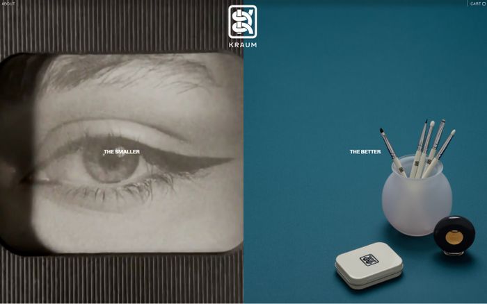
1. Late-90s web nostalgia
What it is. Playful, slightly awkward, digitally native, visually dense, and internet-specific.
WELCOME TO THE NET
Late-90s web nostalgia with CRT glow, dense framed modules, dusty saturated colors, and slight visual awkwardness. Native to early internet, intentionally readable.
Real examples
Phrase block
Use late-90s web nostalgia with CRT glow, playful system-font energy,
dense framed modules, dusty saturated colors, and slight visual
awkwardness. Let it feel native to early internet culture, but keep
the UX readable and intentional.
Good tools: Claude or ChatGPT to refine the tone. Nano Banana for still concept frames. Coding agents for translating the aesthetic into web UI.
Avoid: Polished startup gradients, clean fintech minimalism, and overdesigned retro parody.
2. Y2K retro-futurism
What it is. Chrome, gloss, synthetic optimism, futuristic surfaces, shiny digital spectacle.
The Future Is Now
Y2K retro-futurist with chrome accents, glossy surfaces, bright contrast, sharp highlights. Optimistic and synthetic rather than dystopian.
Real examples

Phrase block
Give this design a Y2K retro-futurist feel with chrome accents,
glossy surfaces, bright contrast, sharp highlights, and bold
futuristic type. It should feel optimistic, synthetic, and visually
charged rather than dystopian.
Good tools: Nano Banana for surface exploration. Kling for animated chrome and glow references. Figma for extracting usable system rules.
Avoid: Dark cyberpunk cliches, cluttered sci-fi noise, and unreadable chrome overload.
3. 70s editorial print
What it is. Warm, analog, cultural, tactile, thoughtful, and less digitally polished.
Volume 3 · Issue 12
Warm paper tones, bold serif headlines, imperfect analog texture, magazine composition. Tactile and human rather than slick.
Real examples
Phrase block
Create a 70s editorial print mood with warm paper tones, bold serif
headlines, imperfect analog texture, magazine-like composition, and
quiet confidence. Let the design feel tactile and human rather than
slick and software-like.
Good tools: Claude or ChatGPT. Nano Banana. Figma.
Avoid: Sterile symmetry, default product-landing-page patterns, and overly modern UI shine.
4. Minimal editorial
What it is. Restrained, typographic, calm, intelligent, and deliberate.
Considered. Quiet. Precise.
Disciplined typography, generous whitespace, quiet surfaces, selective contrast. Thoughtful and high-trust rather than empty or generic.
Real examples

Phrase block
Use a minimal editorial style with disciplined typography, generous
whitespace, quiet surfaces, precise alignment, and selective contrast.
Make it feel thoughtful and high-trust rather than empty or generic.
Good tools: Claude or ChatGPT. Figma. Coding agents.
Avoid: Lifeless minimalism, generic startup whitespace, and a lack of hierarchy.
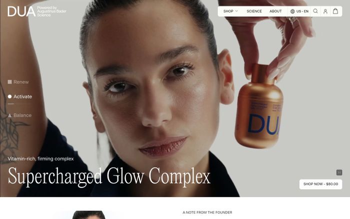
5. Editorial luxury
What it is. Refined, expensive, restrained, tactile, and fashion-adjacent.
Maison Atelier
Elegant serif typography, disciplined spacing, soft neutrals, restrained contrast. Premium because of taste, not flashy effects.
Real examples

Phrase block
Create an editorial luxury direction with elegant serif typography,
disciplined spacing, soft neutrals, restrained contrast, and subtle
but deliberate detail. It should feel premium because of restraint
and taste, not because of flashy effects.
Good tools: Nano Banana for still compositions. Figma for typography and spacing systems. Coding agents for high-end landing pages.
Avoid: Loud gradients, excessive glassmorphism, and obvious premium cliches.
6. Playful tech
What it is. Bright, friendly, energetic, but still credible and product-focused.
Build fun things, faster.
Bright accent colors, clean sans-serif typography, soft geometry, energetic interactions, moments of surprise. Still organized and trustworthy.
Phrase block
Create a playful but credible tech aesthetic with bright accent
colors, clean sans-serif typography, soft geometry, energetic
interactions, and moments of surprise. Keep the structure organized
and trustworthy.
Good tools: Claude or ChatGPT. Figma. Coding agents.
Avoid: Childish illustration overload, toy-like UI, and chaotic gamification energy.
7. Industrial utilitarian
What it is. Operational, precise, mechanical, dense, and engineered.
System.Status: ONLINE
MONO LABELS · RIGID FRAMES · MECHANICAL SPACING · MUTED FUNCTIONAL COLORS. Precise and operational, not warm and consumer-friendly.
Real examples
Phrase block
Use an industrial, utilitarian interface language with mono labels,
rigid information framing, mechanical spacing, muted functional
colors, and an engineered tone. It should feel precise and
operational rather than warm and consumer-friendly.
Good tools: Claude or ChatGPT. Coding agents. Figma.
Avoid: Lifestyle-brand softness, decorative flourish, and vague visual warmth.
8. Swiss modernist
What it is. Grid-led, typographic, rational, timeless, and highly structured.
Form Follows Function
Strong grid discipline, clear hierarchy, sans-serif typography, sharp alignment, restrained color. Rational, timeless, exact.
Real examples
Phrase block
Use Swiss modernist principles with strong grid discipline, clear
hierarchy, sans-serif typography, sharp alignment, and restrained
color. The design should feel rational, timeless, and exact.
Good tools: Claude or ChatGPT. Figma. Coding agents.
Avoid: Arbitrary asymmetry, decorative excess, and weak typographic rhythm.
9. Soft futuristic
What it is. Forward-looking, ambient, intelligent, and calm rather than flashy.
Ambient intelligence.
Ambient light, cool restrained color, clean geometry, subtle glow, quiet confidence. Advanced and elegant, not noisy or cyberpunk.
Phrase block
Give the interface a soft futuristic feel with ambient light, cool
restrained color, clean geometry, subtle glow, and quiet confidence.
It should feel advanced and elegant, not noisy or cyberpunk.
Good tools: Nano Banana. Kling. Coding agents.
Avoid: Neon overload, dystopian darkness, and heavy sci-fi clutter.
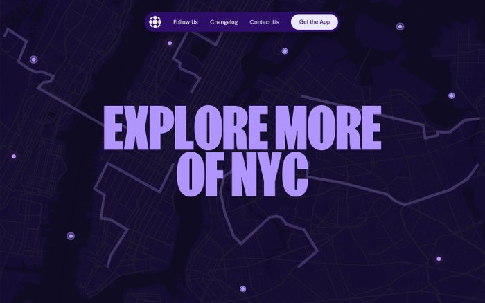
10. Brutalist digital
What it is. Raw, hard-edged, typographically forceful, direct, and anti-polish.
NO MORE NICE THINGS
STARK CONTRAST. HARD EDGES. OVERSIZED TYPE. RIGID BLOCKS. UNAPOLOGETIC AND STRUCTURAL, NOT SMOOTH OR FRIENDLY.
Real examples
Phrase block
Use a brutalist digital language with stark contrast, hard edges,
oversized typography, rigid block structures, and minimal softness.
Let it feel unapologetic and structural rather than smooth and
friendly.
Good tools: Claude or ChatGPT. Coding agents. Figma.
Avoid: Soft shadows, rounded everything, and visual friendliness that dilutes the concept.
11. Contemporary museum
What it is. Cultural, typographic, refined, spatial, and intellectually framed.
On Perception, 2026
Elegant typography, quiet contrast, refined spacing, curated imagery, cultural authority. Composed and thoughtful, not commercial.
Real examples
Phrase block
Design this with a contemporary museum feel: elegant typography,
quiet contrast, refined spacing, curated imagery, and a sense of
cultural authority. It should feel composed and thoughtful, not
commercial or loud.
Good tools: Nano Banana. Figma. Claude or ChatGPT.
Avoid: Promotional clutter, aggressive conversion patterns, and generic lifestyle branding.
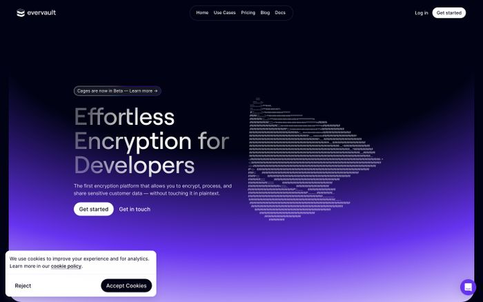
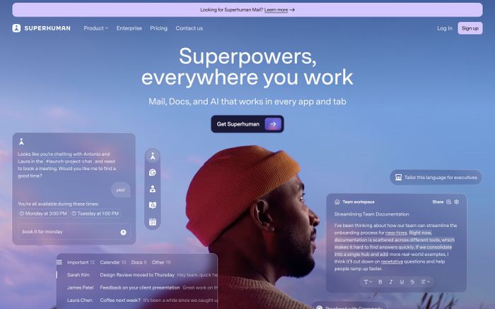
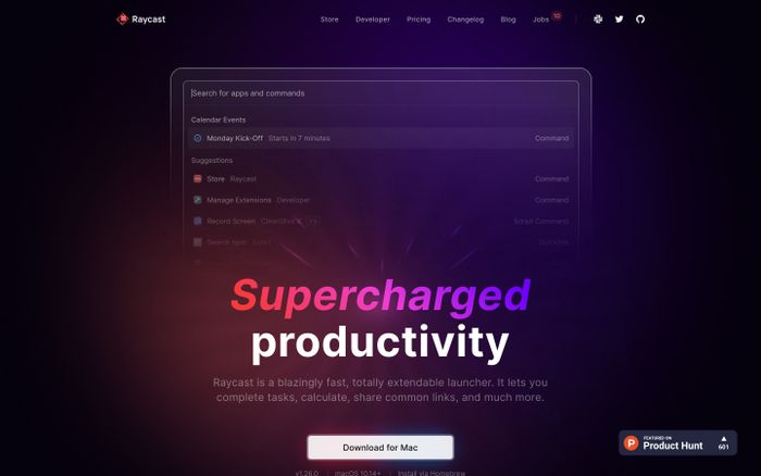
12. Optimistic product modernism
What it is. Clean, bright, confident, accessible, and clear without feeling generic.
Simple, powerful, yours.
Clean structure, balanced spacing, bright but restrained accents, confident typography, approachable clarity. Useful and intelligent, not sterile.
Real examples
Phrase block
Use optimistic product modernism with clean structure, balanced
spacing, bright but restrained accents, confident typography, and
approachable clarity. Let it feel useful and intelligent, not sterile.
Good tools: Coding agents. Figma. Claude or ChatGPT.
Avoid: Default SaaS sameness, weak hierarchy, and over-reliance on gradient glow.
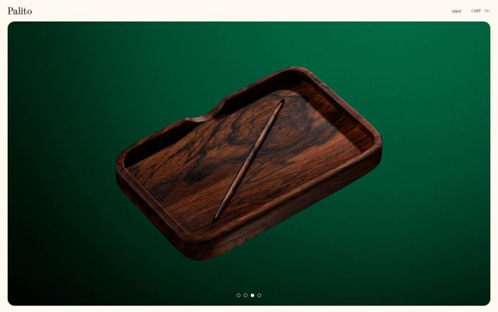
13. Analog craft
What it is. Handmade, textured, warm, imperfect, and soulful.
Made slowly, by hand.
Paper grain, tactile surfaces, imperfect rhythm, warm earthy tones, human-made feeling. Designed by a person with taste, not generated into sterile perfection.
Real examples
Phrase block
Create an analog craft aesthetic with paper grain, tactile surfaces,
imperfect rhythm, warm earthy tones, and a human-made feeling. Let
the interface feel designed by a person with taste, not generated
into sterile perfection.
Good tools: Nano Banana. Claude or ChatGPT. Figma.
Avoid: Clean corporate polish, vector-perfect sterility, and overly glossy treatments.
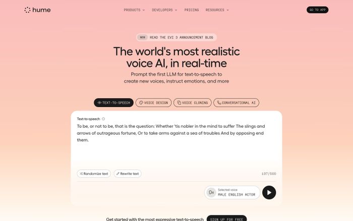
14. Technical premium
What it is. Sophisticated, serious, engineered, and high-trust.
Engineered for scale.
Precise typography, restrained surfaces, cool contrast, disciplined spacing, engineered sense of quality. Premium from exactness, not decoration.
Real examples
Phrase block
Create a technical premium interface with precise typography,
restrained surfaces, cool contrast, disciplined spacing, and an
engineered sense of quality. The premium feeling should come from
exactness and confidence, not decoration.
Good tools: Coding agents. Figma. Claude or ChatGPT.
Avoid: Luxury-fashion tropes, soft consumer-app cues, and decorative excess.
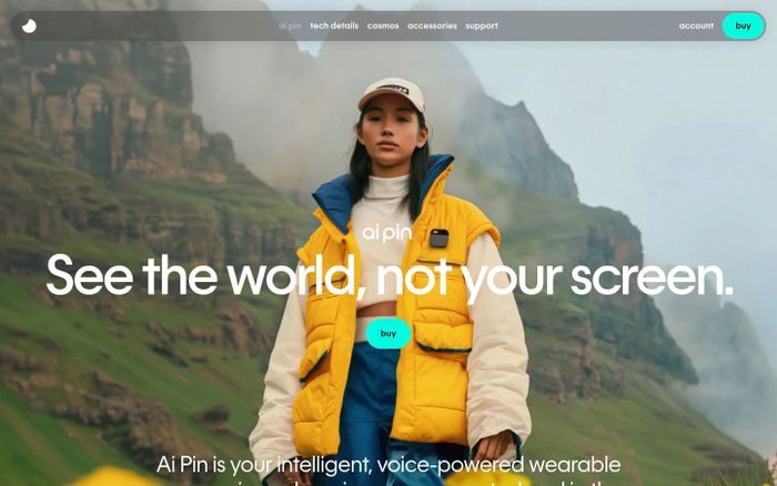
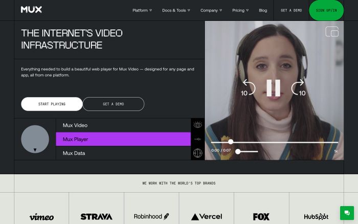
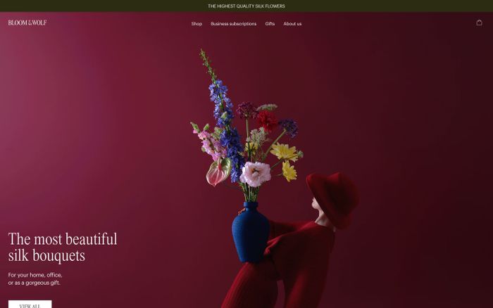
15. Campaign hero spectacle
What it is. Big visual energy, cinematic framing, motion-rich atmosphere, and narrative impact.
The Launch. This Summer.
Cinematic composition, strong foreground-background separation, dramatic lighting, bold scale shifts, motion-ready energy. Striking and memorable.
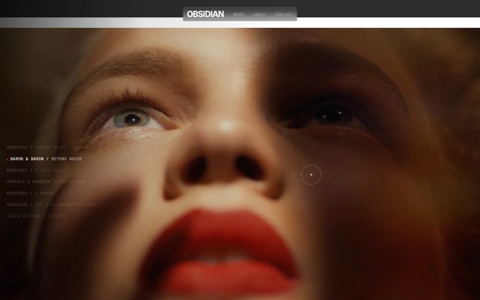
Phrase block
Create a campaign-style hero with cinematic composition, strong
foreground-background separation, dramatic lighting, bold scale
shifts, and motion-ready visual energy. It should feel striking and
memorable while still supporting readable content.
Good tools: Nano Banana for still hero concepts. Kling for motion mood tests. Coding agents for implementation of the final system.
Avoid: Unusable layout theatrics, unreadable text overlays, and spectacle without hierarchy.
16. Quiet intelligence
What it is. Smart, understated, calm, exact, and high-trust.
The obvious choice, quietly.
Restrained typography, disciplined spacing, subtle material contrast, muted color, a sense of control. Deeply considered, not attention-seeking.
Real examples

Phrase block
Design this with quiet intelligence: restrained typography,
disciplined spacing, subtle material contrast, muted color, and a
sense of control. It should feel deeply considered, not loud or
attention-seeking.
Good tools: Claude or ChatGPT. Figma. Coding agents.
Avoid: Trend-chasing effects, decorative busyness, and over-explanation through visuals.
17. Playful maximalism
What it is. Loud, layered, energetic, expressive, and full of attitude.
MORE. MORE. MORE.
Layered color, expressive typography, energetic contrast, unexpected scale changes, abundance. Intentional and designed, not messy.
Phrase block
Use playful maximalism with layered color, expressive typography,
energetic contrast, unexpected scale changes, and a sense of
abundance. It should feel intentional and designed, not messy for
its own sake.
Good tools: Nano Banana. Kling. Claude or ChatGPT.
Avoid: Random clutter, weak hierarchy, and visual chaos that hurts usability.
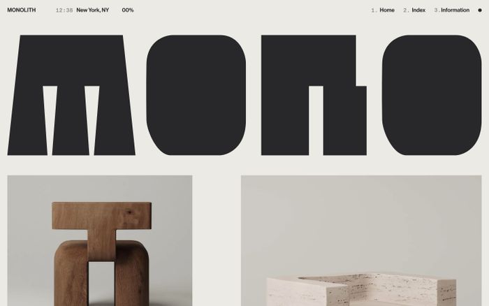
18. Archive interface
What it is. Systematic, reference-heavy, text-first, documentary, and information-dense.
INDEX · 1,247 ENTRIES
Text-forward hierarchy, metadata-rich composition, systematic framing, restrained color, curated collection feel. Referential and intelligent, not decorative.
Real examples
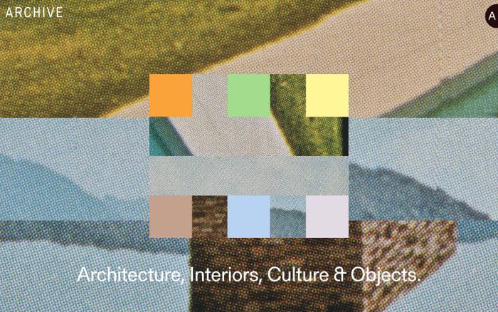
Phrase block
Create an archive-like interface with text-forward hierarchy,
metadata-rich composition, systematic framing, restrained color, and
the feeling of a curated collection. It should feel referential and
intelligent rather than decorative.
Good tools: Figma. Coding agents. Claude or ChatGPT.
Avoid: Empty hero-led layouts, excessive whitespace, and image-first marketing tropes.
19. Soft tactile consumer
What it is. Warm, inviting, rounded, human, and easy to approach.
A calmer way to start the day.
Gentle curves, warm neutral surfaces, quiet shadows, approachable typography, calming spacing. Human and easy, not toy-like or overly precious.
Real examples
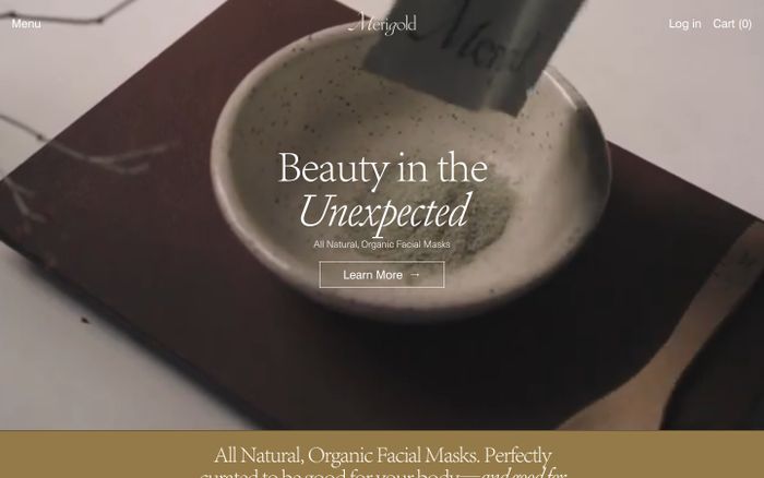
Phrase block
Use a soft tactile consumer aesthetic with gentle curves, warm
neutral surfaces, quiet shadows, approachable typography, and calming
spacing. Let it feel human and easy, not toy-like or overly precious.
Good tools: Figma. Coding agents. Nano Banana.
Avoid: Saccharine softness, childish color palettes, and excessive illustration dependency.
20. Deconstructed editorial tech
What it is. Experimental, typographic, layered, design-forward, and slightly disruptive.
Break the grid. Keep the rigor.
Layered typography, deliberate asymmetry, sharp image-text interplay, confident spacing disruptions, cultured but digital tone. Authored, not random.
Real examples
Phrase block
Create a deconstructed editorial tech direction with layered
typography, deliberate asymmetry, sharp image-text interplay,
confident spacing disruptions, and a cultured but digital tone. It
should feel authored and directional, not random.
Good tools: Claude or ChatGPT. Nano Banana. Coding agents.
Avoid: Arbitrary collage aesthetics, broken readability, and fashionable chaos without logic.
How to turn style into website effects
Many designers can describe a look, but not the movement. That is where prompts often stay too static.
To create stronger hero effects, background atmospheres, or campaign-style website motion, describe:
- what is moving
- how fast it moves
- what kind of energy it has
- whether it feels analog, cinematic, digital, elastic, mechanical, or ambient
- whether the movement supports reading or steals attention
Motion phrase patterns
Ambient atmosphere
Use slow ambient movement with soft parallax, subtle depth
separation, and barely-there light shifts that make the page feel
alive without distracting from the content.
Cinematic reveal
Use cinematic reveal timing with controlled fades, layered
foreground-background motion, and one strong moment of emphasis in
the hero area.
Mechanical motion
Use mechanical snap transitions, precise timing, rigid movement
paths, and a sense of engineered response rather than playful
elasticity.
Analog motion
Use analog-style flicker, texture drift, scan-line shimmer, or
imperfect jitter so the motion feels tactile and archival rather
than digitally sterile.
Energetic campaign motion
Use bold scale changes, fast directional transitions, and
high-contrast emphasis moments so the page feels like a campaign
launch, not a neutral product site.
The Nano Banana + Kling workflow
This is especially helpful for hero sections, launch pages, and branded motion exploration.
Step 1: Create still frames in Nano Banana
Use it to generate 3 to 5 visual directions for:
- hero moods
- product framing
- background atmospheres
- visual textures
- lighting directions
Prompt example:
Create a cinematic landing-page hero concept for an AI design product.
Use late-90s internet nostalgia mixed with refined contemporary
composition. CRT glow, dusty saturated colors, framed UI modules, and
a sense of digital atmosphere. Make it feel striking and web-native,
not like a movie poster.
Step 2: Turn the strongest frame into motion ideas in Kling
Use Kling to explore:
- how light moves
- how background layers separate
- how particles, glow, or texture drift behave
- whether the mood feels elegant, dramatic, or distracting
Prompt example:
Animate this visual direction with slow atmospheric motion, gentle
depth movement, soft CRT shimmer, and subtle light pulsing. Keep it
premium and web-appropriate, not cinematic in a way that overwhelms
the content.
Step 3: Extract motion rules
Do not copy the video literally into the website. Extract rules like:
- glow strength
- motion speed
- depth layering
- opacity shifts
- whether movement loops cleanly
- whether text remains readable
Step 4: Implement with restraint
Translate the effect into:
- CSS gradients
- layered absolute-position backgrounds
- blur
- opacity animation
- transform and scale transitions
- WebGL or canvas only if truly needed
The goal is not to recreate an AI video exactly. The goal is to harvest better visual direction from it.
Prompt upgrades
Weak → Better
Weak: Make it premium and futuristic
Better:
Create a soft futuristic interface with cool ambient light,
restrained typography, calm depth, and subtle motion that feels
advanced but not sci-fi. Avoid loud neon and cyberpunk cliches.
Weak: Make it retro
Better:
Create a late-90s internet nostalgia direction with CRT glow, dusty
saturated color, framed modules, playful system-font energy, and
slight visual awkwardness. Keep the UX readable and modern. Avoid
parody and polished startup aesthetics.
Weak: Make the hero animation stunning
Better:
Create a campaign-style hero effect with slow atmospheric motion,
controlled lighting shifts, strong foreground-background separation,
and one high-impact focal moment. Keep the movement elegant and
supportive of readability.
How to adapt any style direction
Ask these questions:
- Is this for a landing page, app UI, editorial story, or marketing campaign?
- Should it feel more premium, more playful, more cultural, or more technical?
- Is the style carried mostly by typography, surface, layout, or motion?
- What would make this feel too generic?
- What would make this feel too extreme to ship?
Then rewrite the phrase block for your exact context.
Recommended output format from AI
When you use any phrase in this guide, ask the AI to return:
- a short style summary
- typography direction
- palette direction
- layout rules
- interaction rules
- motion rules
- what to avoid
- one prompt for image generation
- one prompt for front-end generation
Reusable prompt templates
For style direction
I am designing a [site/app/component] for [audience].
I want it to feel like [style direction].

Please turn this into a usable design direction.
Include:
- style summary
- typography
- palette
- layout behavior
- surface/material treatment
- motion cues
- what to avoid
- a prompt for visual exploration
- a prompt for front-end generation
For Nano Banana
Create 4 distinct visual concept frames for a [site/page] in a
[style direction] aesthetic. Focus on composition, lighting,
atmosphere, texture, and UI mood. Keep the output usable as a web
design reference, not as a fantasy illustration.
For Kling
Animate this visual concept with [motion style].
Use [lighting behavior], [depth behavior], and [energy level].
Keep it elegant and web-appropriate. The motion should support
readability and feel like a premium website hero reference rather
than a trailer sequence.
Final note
The best designers using AI are not just good at prompting. They are good at:
- naming taste
- separating style from trend
- translating references into systems
- using the right tool at the right stage
This phrasebook is meant to help with that transition.
Pick a direction, adapt its phrase block, generate against it
-
Choose one direction and rewrite the phrase block for your product
Pick one style direction from the twenty above. Copy its phrase block. Rewrite it specifically for a product you own: add the audience, replace the generic nouns with the actual thing you are designing (a pricing page for enterprise buyers, a dashboard for mobile creators, etc.). Keep every slot in the master prompt structure filled: surface, typography, layout, motion, avoid.
- Every bracket in the master prompt structure is filled with something specific
- The “avoid” clause names patterns you see in your competitors, not generic ones
- The block is shorter than the original but more specific
- Someone reading it could sketch a rough version without seeing the preview
-
Generate three variants and pick the one that surprises you
Paste the adapted block into a coding agent (Claude Code, v0, Lovable, Figma Make). Ask for three distinct HTML implementations of the same page in that style. Review all three side by side. Pick the one that feels least like your existing site. That tension is the point: the exercise is pulling you away from defaults, not toward them. Ship the surprising one to a feature branch or preview URL.
- Three variants that feel meaningfully different from each other, not three versions of the same layout
- At least one variant does something you would not have instinctively approved
- You can trace a visual decision (a border treatment, a color choice, a type pair) back to a specific phrase in the block
- The surprising variant lives on a preview URL you can send to a teammate for reaction
Finished this lesson?
Mark it complete to track your progress through "Visual Direction & Style".
The guides alone saved me a full day of work every sprint.
- All guides, prompts, and templates
- Starter kits and templates
- New content every week
- Priority support